

BONUS GRAPH: Overlaying 2014 on top of 2015
Tue, 12/16/2014 - 11:57pm
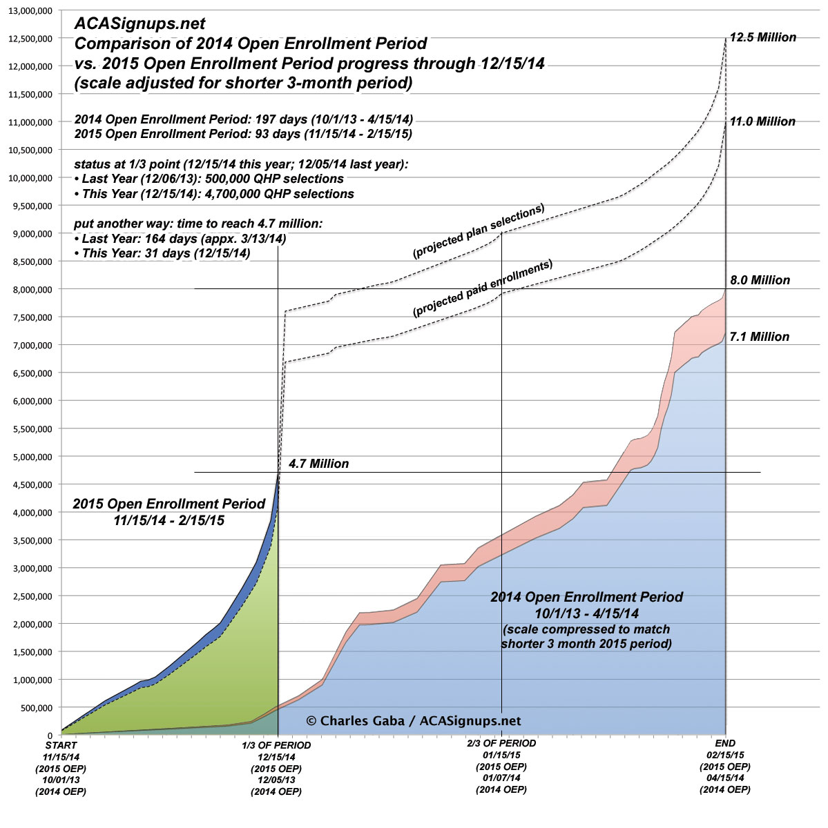
After all the craziness of the past day or two, I figured this would be a good time for a reality check. I've taken the 2014 Open Enrollment Period Graph, compressed it so that the time period and scale match the 2015 Period (ie, 3 months instead of 6.5) and have overlaid it on top of the 2015 Graph to see how they compare. The comparison is pretty striking.
(NOTE: I've modified this version to make the adjusted timeframes less confusing, and clicking below will now load the full-size version in a new window):
Advertisement
