IT'S ALIVE!! Healthcare.Gov 2015 QHP Window Shopping Now Online!
Ask and ye shall receive:
https://www.healthcare.gov/see-plans/
UPDATE: It took me awhile to find this link from the home page of HC.gov, but it turns out it's the very first one ("Get Coverage") in the top left corner. You have to enter your state first because they want people from states using their own exchange such as California, Colorado, Kentucky etc. to be directed to the correct website.
UPDATE x2: OK, they've actually already changed the home page to also include a big "See Plans & Prices" button in the middle of the page as well:


A few key things to note right off the bat:
- From a technical/design POV, the new site is indeed like night and day from where it was a year ago. The new site is fully mobile-responsive, loads very quickly, extremely streamlined data entry, the ability to edit any/all info on the fly, and you can choose from multiple filtering criteria via Amazon-style "filtering" instead of just one at a time. That is, last year you could compare metal levels, companies, premium ranges, PPOs vs. HMOs and so on...but only one of these sets of criteria at a time. Now, you can "drill down" to the specific types of policies that you're interested in, or remove certain filters to check them out another way. Very nice.
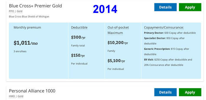
- I've already plugged in my own family's current BCBSM policy to compare it against 2014. In our case, the full price (without any tax credits) has gone up by 7.4%:


- HOWEVER, the tax credit for this particular policy, in our particular zip code, with our particular household, has also gone up noticably:


(note: I'm not saying that our income is $50,000, it just seems like a reasonable median figure to use for illustrative purposes)
- So, in our case at least, the full price if we kept the exact same policy would go up from $1,011 to $1,086 per month ($75, or 7.4%). However, with a $50K taxable income, our actual cost would only go from $745 to $787.5 per month ($42.50, or 5.7%).
Obviously these numbers will vary greatly depending on which state you live in, which county/zip code, what your age is, how many dependents, your income last year/this year, what policy you're moving from and to and several other factors.
Which is why it's very, very important to actually log into HC.gov (or your state-run exchange) and check out your policy options instead of blindly auto-renewing.
- Notice that instead of using a drop-down menu to plug in your state and county, now you just type in just your zip code. Not only does this save a step, it also is easier for smartphones (I'm not a fan of how the iPhone handles drop-down options myself...not sure how clunky it is in Android).
- The same is true of entering your age: Text box instead of drop-down numbers. It also asks whether each member is a smoker or not, which is an interesting addition (it didn't do this last year, at least not in Michigan...I figured it varied by state depending on state law?)
- Another improvement: Last year, if you wanted to enroll in a dental plan, from what I could tell you could only do so if you had already enrolled in a healthcare policy already, which never made any sense to me. This year it looks like you can enroll in dental standalone, although that might not be the case (remember, this is just for comparison shopping, not actual enrollment yet).
- One minor criticism, however: Yes, the new shopping system does clearly state what your premium tax credit is before you actually shop around. However, a shockingly high number of people apparently still don't seem to grasp the concept that the price they'll be paying is after tax credits are applied. The solution to this, it seems to me, is to make it very, very clear that they're receiving the credit.
Take a look at how the premium prices are displayed at the moment:

Not bad...the actual price is displayed prominently. However, notice that the full retail price, while listed, is in a very small font.
Think about how cars and other big-ticket retail products price tags are displayed with "rebates", "cash incentives" and so on. Here's how I would do it.

See what I mean? You're still drawing their eye to their actual price (thus avoiding sticker shock for those on a tight budget), but are making crystal clear that there's a reason why they're enrolling through the ACA exchange instead of directly through Blue Cross, Humana or whatever.
How to support my healthcare wonkery:
1. Donate via ActBlue or PayPal
2. Subscribe via Substack.
3. Subscribe via Patreon.


