

The Graph: Updated w/May CMS Data & Unpaid QHPs removed
Fri, 07/11/2014 - 3:57pm
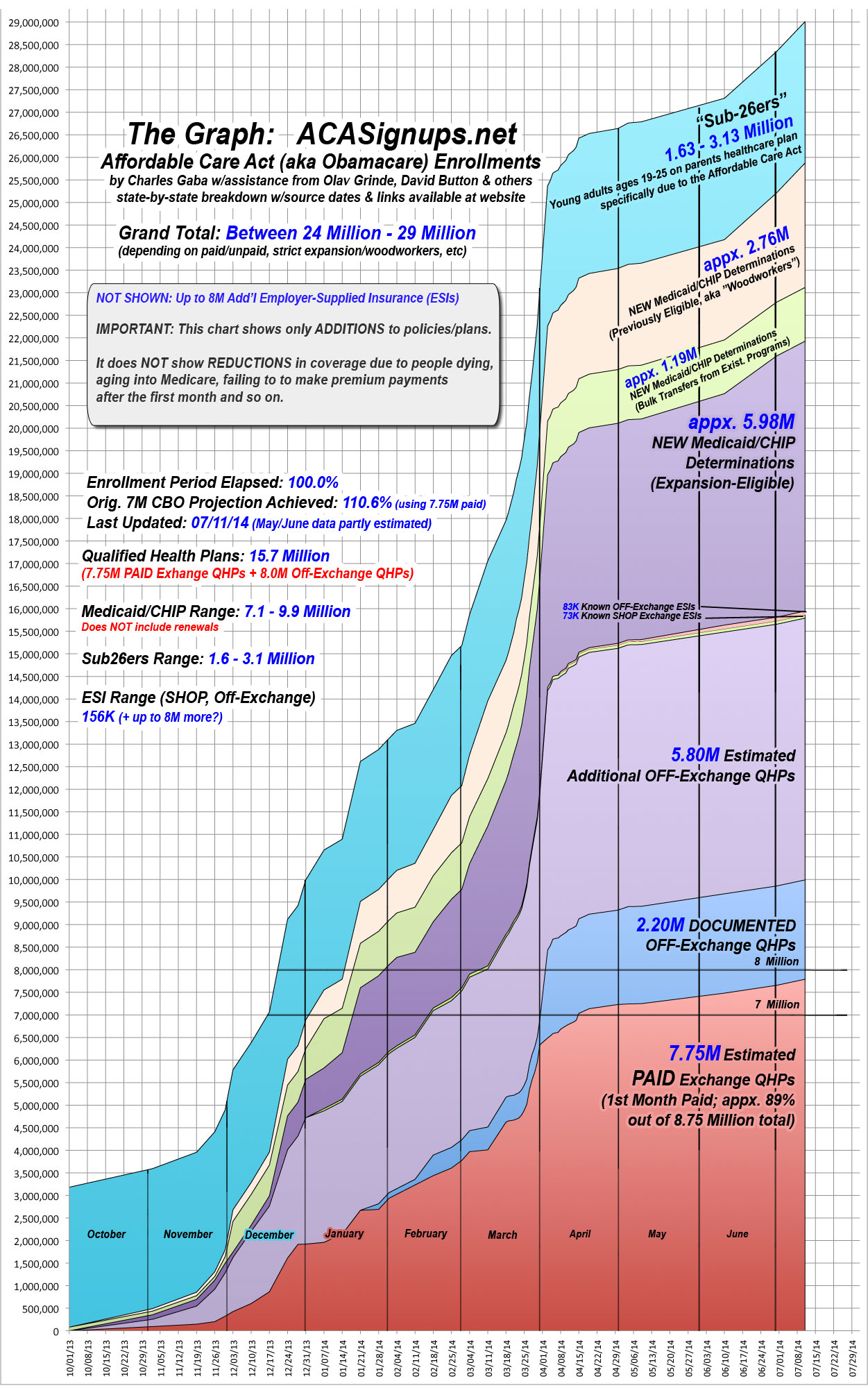
OK, I've just updated The Graph again, with two major changes: First, I've updated it to include the new May 2014 CMS Medicaid/CHIP report data, which nudges the total up by several hundred thousand.
In addition, however, I've also done something which has been on my mind for awhile now: For the first time, I've removed the UNPAID Exchange QHP section from the graph completely. In addition, I've knocked the "Paid" percent down one more notch to 89%--not because I've changed my mind about the eventual paid percentage hitting 90%, but because at any given time the most recent enrollees (from the past couple of months) will fall below that threshold, meaning the overall paid percentage will be slightly lower.
In any event, by removing the unpaid enrollees altogether, the graph should be more accurate and easier to follow. Yanking the appx. 1 million unpaid exchange QHPs effectively cancels out the new Medicaid additions, meaning the overall numbers still range between 24 - 29 million.
Advertisement
