

Avalere Health Releases State-Level QHP Study, Plus My Own State-by-State Achievement Chart (UPDATED x3)
Sun, 05/04/2014 - 8:42pm
Hat Tip To:
Dan Goldberg
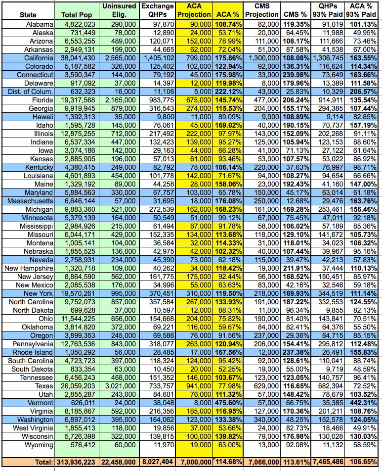
A couple of days ago, Avalere Health (with whom I've alternately butted heads and agreed with on various Medicaid enrollment data issues) released a study which, at first glance, seems to paint a fairly positive picture of how well the ACA exchange QHP enrollment ended up doing: Enrollment expectations were exceeded in 22 states, even if you assume only an 85% final premium payment rate!
However, there's a couple of data points which Avalere chose to use which made me furrow my brow. The first is that they based their findings on the CBO's lowered projection number of 6 million exchange-based QHPs instead of the original 7 million figure. I suppose there's nothing wrong with doing this, but considering that the actual grand total ended up being well over 8 million, it seemed a bit odd to me that they'd choose to compare the state-level figures against the lower, 6 million figure when there really isn't a need to do so.
More curious to me, though, was this line from their press release:
Notably, while New York has the fourth largest number of enrollees nationwide, the state enrolled only 49 percent of its expected participants.
New York's final QHP tally ended up being 370,451. The CMS's original state-level target for New York was only 218,000...and that was assuming the higher, 7 million national figure. You'd have to more than double 370K to 741,000 for it to only hit 49%.
Now, Avalere did assume only an 85% premium payment rate, which partially explains the discrepancy...except that even then, NY's QHP total is still 314,883...which is 49% of around 643,100.
Which is exactly the "target" number that Avalere came up with for New York in this report.
So...where did that 643.1K target come from (and remember, that's based on only 6 million nationally, not the original 7 million that the CBO was projecting last year)?
I have no idea. The only reference given by the Avalere report is this:
This approach assumes smooth implementation across states; that is, eligible populations take up coverage at similar rates across states.
I honestly don't know what to make of that. I've done my own breakdown of the 7 million national figure based on a proportional distribution of the uninsured population by state, based on the total number of uninsured residents who are eligible for exchange-based QHP enrollment (that is, after subtracting undocumented immigrants and those who are either eligible for Medicaid expansion or who were caught in the Medicaid gap in the case of non-expansion states).
Using this formula, the total potential share of 7 million (not 6) belonging to New York State is still only 310,000, not 643,100.
There's similar oddness in the "target" numbers for the other states as well, but New York is the most glaring. In fact, according to the Avalere report, NY's "target" number is HIGHER than California's 641,500. Bear in mind that California's total population is nearly double that of New York, and their total uninsured population is over three times that of NY, so this makes no sense whatsoever to me.
UPDATE: I've contacted Caroline Pearson of Avalere Health to inquire about the unusual state-level target numbers; she's publicly tweeted back the following response...I'll post her more detailed response once I receive her OK to do so:
@charles_gaba @DanGoldbergCNY Happy to explain our methodology. Our state-based assumptions account for exchange eligible pops & Mcaid expan
— Caroline Pearson (@CPearsonAvalere) May 5, 2014
@charles_gaba @DanGoldbergCNY (1/2) Major driver of the NY projections specifically is the fact that NY will scale back Mcaid eligibility.
— Caroline Pearson (@CPearsonAvalere) May 5, 2014
@charles_gaba @DanGoldbergCNY (2/2) So, NY will at some point move current expansion Mcaid benes into exchange, but not happening fast.
— Caroline Pearson (@CPearsonAvalere) May 5, 2014
UPDATED x2:
OK, I've received a formal response from Ms. Pearson of Avalere Health. I'm reposting it verbatim below without further comment:
This analysis, like all previous, relies on Avalere’s proprietary enrollment model to project state-level exchange participation. Since enactment of the Affordable Care Act (ACA), Avalere has developed and continually refined an enrollment model that projects coverage over ten years at the state level. The model accounts for state decisions about whether to expand Medicaid.
In addition to enrollment reports from the federal government, Avalere utilizes a range of data sources to account for local population demographics and experience. Such sources include data from the Congressional Budget Office (CBO), Centers for Medicare & Medicaid Services (CMS) on Medicaid Managed Care Enrollment Report and Medicare Enrollment, the Census Bureau’s American Community Survey (ACS) and Current Population Survey (CPS), and the Urban Institute. Avalere also evaluates past program launches including the Medicare Part D Program and the Massachusetts exchange, known as the Health Connector.
For exchanges specifically, our model primarily examines local coverage and demographic information for the exchange-eligible population, which primarily includes the uninsured and non-group markets pre-2014. We also includes some other modest shifts such as those out of employer coverage and those in states that previously had more generous Medicaid programs, planning to roll back eligibility to 138% of poverty and move these lives into the exchanges. The last assumption has a big impact on the projections for New York, where parents up to 150% FPL were eligible for the Family Health Plus waiver program. While this program is not traditional Medicaid, it is operated through an 1115 waiver from CMS. Because the state has indicated via CMS that eligibility for parents is now at ACA levels, we have assumed that this population moves over to the exchanges over the next two years. We based our estimate on the number of beneficiaries affected by this change on CPS data for non-elderly adults reporting Medicaid coverage with incomes over 138% of poverty. At the moment, it appears that New York’s exchange enrollment data from HHS does not include these current Medicaid enrollees, which is what drives the big gap between NY’s enrollment and projections. We haven’t been able to determine whether this is a reporting issue or whether the state has delayed transitioning these Medicaid beneficiaries until a later date.
To your question as to why Avalere compared to CBO’s estimates of 6M, we are working to show how states are progressing relative to expectations just a couple of months ago. Given the difficult roll out, few expected that we would exceed 8M by the end of open enrollment. The Administration’s outreach efforts in March clearly had a huge effect at bringing more people out, plus we have seen how important deadlines are to get folks to act. Thus, we wanted to maintain this point of comparison to underscore progress since February when CBO updated their numbers, and to maintain a stable point of comparison month over month.
In any event, by my own calculations (see chart below):
- Using my own "fair share of 7 million" rankings, at 100% payment, the following 27 states beat projections:
-
Alabama, California, Colorado, Connecticut, Delaware, District of Columbia, Florida, Georgia, Idaho, Kentucky, Maine, Massachusetts, Michigan, Missouri, Montana, Nebraska, New York, New Hampshire, North Carolina, Pennsylvania, Rhode Island, Tennessee, Utah, Vermont, Virginia, Washington, and Wisconsin
-
-
Using the "fair share of 7 million" ranking at 93% payment, this drops down to 24 states:
-
Alabama, California, Colorado, Connecticut, Delaware, District of Columbia, Florida, Georgia, Idaho, Maine, Massachusetts, Michigan, Missouri, Montana, New Hampshire, New York
North Carolina, Pennsylvania, Rhode Island, Utah, Vermont, Virginia, Washington and Wisconsin.
-
- Finally, for the heck of it, if I throw in the original, weird state-level projections put out by CMS based on the original 7 million CBO number, the number jumps up to 32:
-
Alabama, Arizona, California, Colorado, Connecticut, Delaware, Florida, Georgia, Hawaii, Idaho, Illinois, Indiana, Kansas, Louisiana, Maine, Michigan, Mississippi, Missouri, Montana, Nebraska, New Hampshire, New Jersey, New York, North Carolina, Pennsylvania, Rhode Island, South Carolina, Tennessee, Texas, Utah, Virginia and Wisconsin.
-
UPDATE x3: Well this is a pleasant surprise:
Updated state exchange analysis with revisions & clarifications h/t @WAplanfinder @charles_gaba. http://t.co/FWPoTRAPxu
— Caroline Pearson (@CPearsonAvalere) May 6, 2014
The main differences I can see are the removal of the reference to New York as doing especially poorly (although it's still showing up as only 49% in the actual chart), and the addition of the following explanation of why certain states appear to be doing so much worse than the numbers would normally indicate:
For exchanges specifically, our model primarily examines local coverage and demographic information for the exchange-eligible population, which primarily includes the uninsured and non-group markets pre-2014. We also include some other modest shifts such as those out of employer coverage and those in states that previously had more generous Medicaid programs, planning to roll back eligibility to 138% of poverty and move these lives into the exchanges. Avalere assumes that seven states—Connecticut, Maine, New Jersey, New York, Rhode Island, Vermont, and Wisconsin—are shifting higher-income, adult Medicaid beneficiaries out of their Medicaid programs and into exchange coverage. It is unclear how quickly these states are making this transition, which could make the enrollment projections for these states appear higher than expected.
Advertisement
