

In which a Twitter troll asks a stupid question but I decide to humor them anyway.
Sun, 01/23/2022 - 1:36pm
So, I plugged in the latest COVID case & death rates at the county level as I do every week. I recently decided to switch from using the beginning of the Delta wave as my starting point (June 30, 2021) to using the "start" of the Omicron wave (around December 15, 2021 as far as I can figure) instead.
Last night, however (yes, I know I'm a nerd doing this on a Saturday evening), I decided to see what it looks like if I use June 30th as my starting point again, and this generated a pretty remarkable contrast which goes to show two things: First, just how insanely contagious the new Omicron COVID variant is; and second, how extremely effective the COVID vaccines are (especially with the 3rd/booster dose added to the mix).
Here's the updated county-level case rates across all 50 states +DC, broken out into 10 roughly equal populations by 2-dose vaccination rate (booster data wasn't available as of this writing):
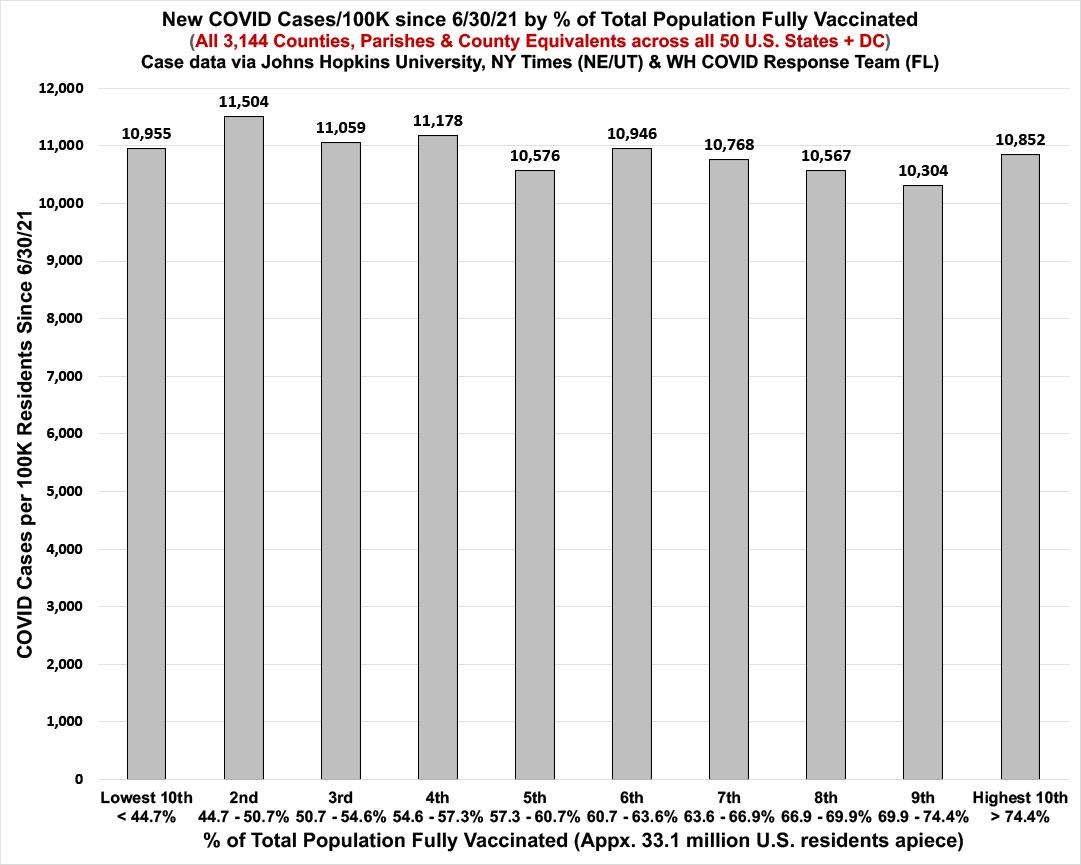
As you can see, while there were some points during the Delta wave when cases were running as much as 2.3x higher per capita in the least-vaccinated decile of the U.S. than the most-vaccinated decile, this has been completely cancelled out in the first five weeks or so of the Omicron wave. ALL TEN BRACKETS have now seen almost identical case rates over the past 6 1/2 months.
OK, this proves how crazy contagious Omicron is (as if the nearly-a-million-new-cases-per-day we've seen in recent weeks wasn't evidence enough). What about death rates, however?
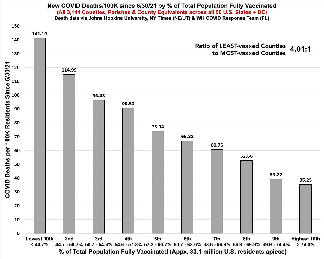
Wow. Even with nearly the exact same case rates across all 10 deciles of the U.S. population, the death rate since June is still a whopping four times higher in the least-vaccinated tenth than the most vaccinated tenth.
This is a hell of a testament to how effective the vaccines are at preventing death from Omicron, even if they aren't so great at preventing actual infection.
Anyway, I posted both of the graphs above on Twitter last night, and while most of the responses were understandably impressed by the contrast, there was one particularly inane criticism:
The catch is data since 6/30/2021 is some of the worst cherry picking you can do. If you expand the data series to the start of the pandemic the death rate is basically similar.
This is terrible misuse of statistics!
— IDKFA (@IDKFA3) January 23, 2022
Ummmm...ok, then.
Can anyone tell me what's wrong with this person's logic?
Yes, that's right: They're criticizing me for not including the COVID deaths during the ~11-month period when there was no COVID vaccine available, as well as another couple of months when only a small percent of the population could get vaccinated when creating a graph which specifically looks at the COVID death rate based on vaccination rates.
(blink.)
I made a quick, snarky comment about this on Twitter and didn't think any more of it...until this morning, when none other than economics professor, NY Times columnist and Nobel Prize winner Paul Krugman picked up my point and ran with it:
I think Charles may be being too subtle here. Also, not just one critic. I'm getting a lot of "You say vaccines save lives, but lots of people died in highly vaccinated New York back in early 2020 (before vaccines were available)" 1/
— Paul Krugman (@paulkrugman) January 23, 2022
And, of course, accusations that anyone comparing death rates since the vaccines — which are correlated with Trump vote, bc vaccination is so partisan — is being a dishonest political shill 2/
— Paul Krugman (@paulkrugman) January 23, 2022
Obviously the original critical tweet didn't deserve any response from either myself or Krugman; "don't feed the trolls!" is the common refrain.
However...once in awhile I can't help myself, so I decided to say what the hell and treat the complaint as if it was an intellectually honest one. Why? Because I have wayyyy too much free time on my hands.
And so, I decided to go ahead and run the exact same death rate by vaccination rate graph INCLUDING that horrific first COVID wave nearly two years ago, when New York City in particular (along with New Jersey and several other major urban population centers) were being devastated, when there was not only no vaccinations available but also little to no testing and for at least part of that time, no masking or social distancing in most areas.
In short, the graph below includes the ~330,000 Americans who died before COVID vaccines were made available to any Americans, the ~240,000 who died between the first Americans receiving a shot and the vaccines being made widely available to all adults in early April, and the ~30,000 more who died between then and June 30th...the starting point of the graph they complained about. (Keep in mind that it takes around 5-6 weeks from the point someone receives their first dose until the point that their 2nd dose is fully effective.)
Here's the kicker: Even when you include every American who died prior to vaccines being available, the cumulative COVID death rate as of today is still 73% higher in the least-vaccinated tenth of the U.S. than the most-vaccinated tenth:
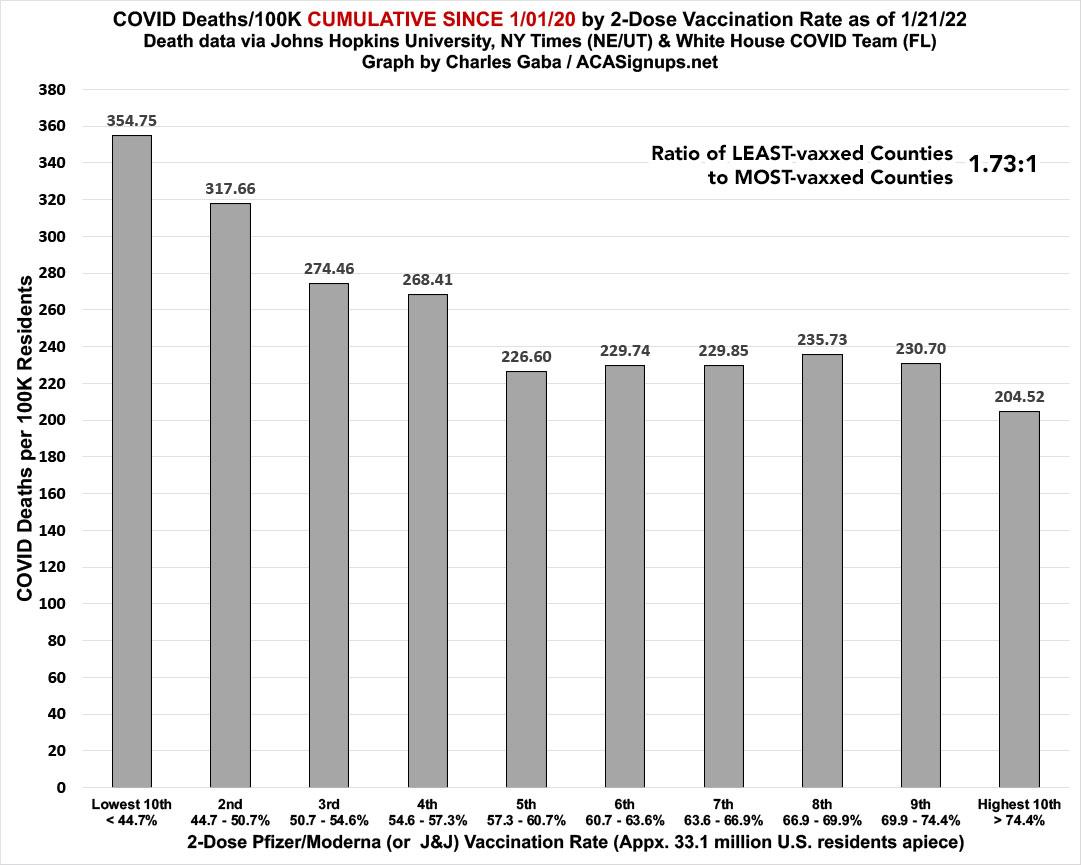
It's important to note that the vaccination rates themselves obviously change over time, as more and more people get vaccinated. The brackets above are based on the current 2-dose vaccination rate as of Friday, January 21st, 2022.
One more thing: Just for the heck of it, I took it one step further: Remember, the original critic emphasized the absurdly high death rate in New York City specifically during that first terrible wave in March-May 2020.
So, what does the cumulative death rate look like if you take NYC out of the equation? Voila:
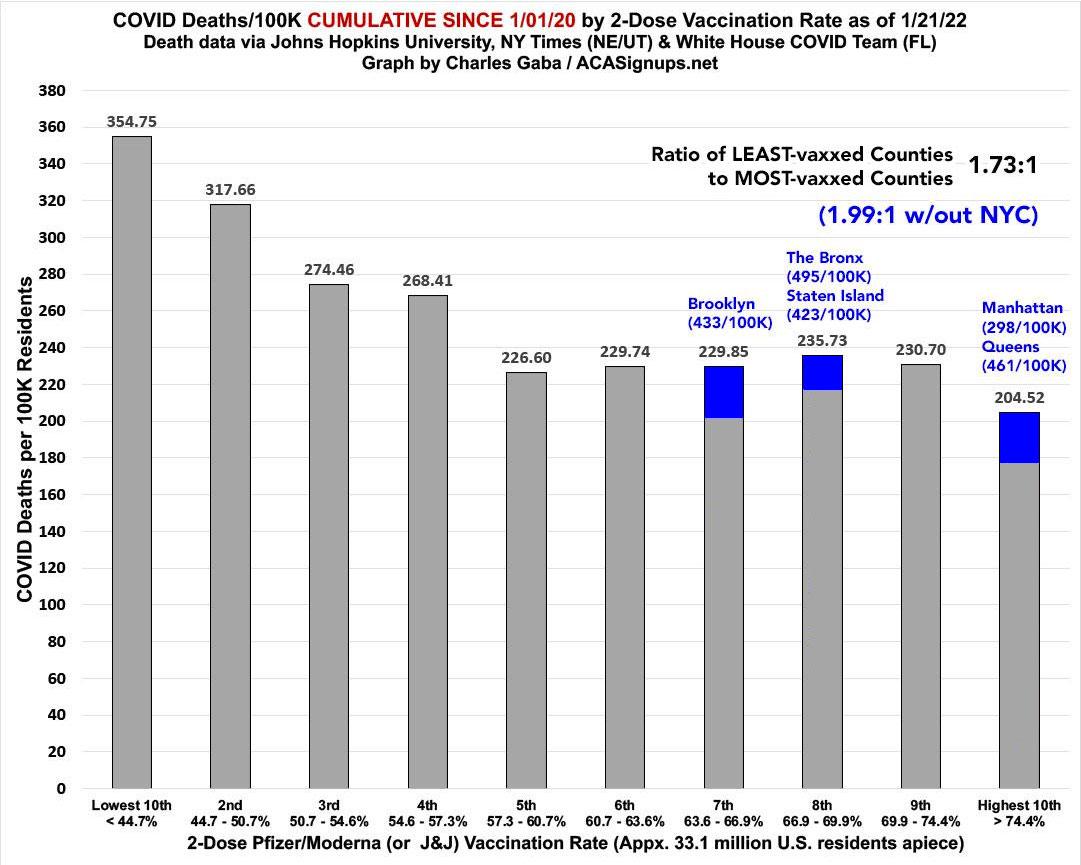
That's right: As horrible as the massive COVID death toll has been in New York City, it still only comprises around 4.4% of total U.S. COVID deaths to date...and NYC's deaths through 6/30/21 only make up 3.9% of it.
Get vaccinated, for the love of God, and get boosted if you're at least 5 months out from your 2nd shot.
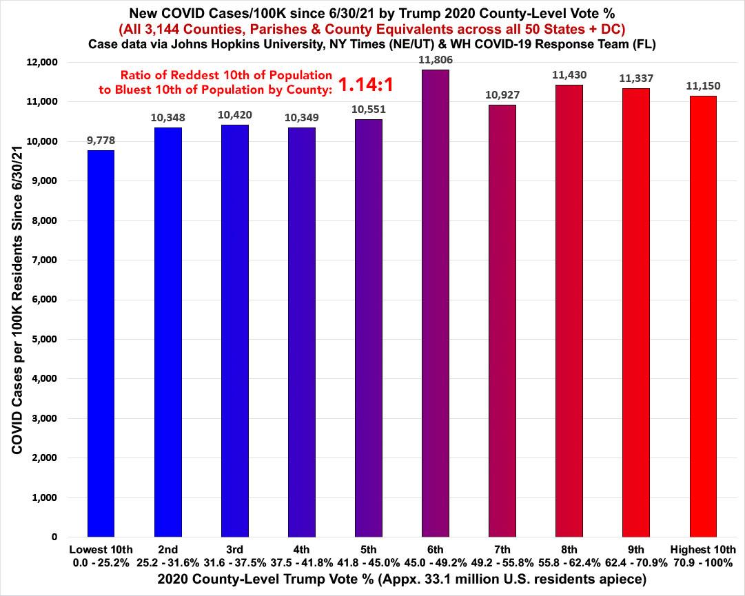
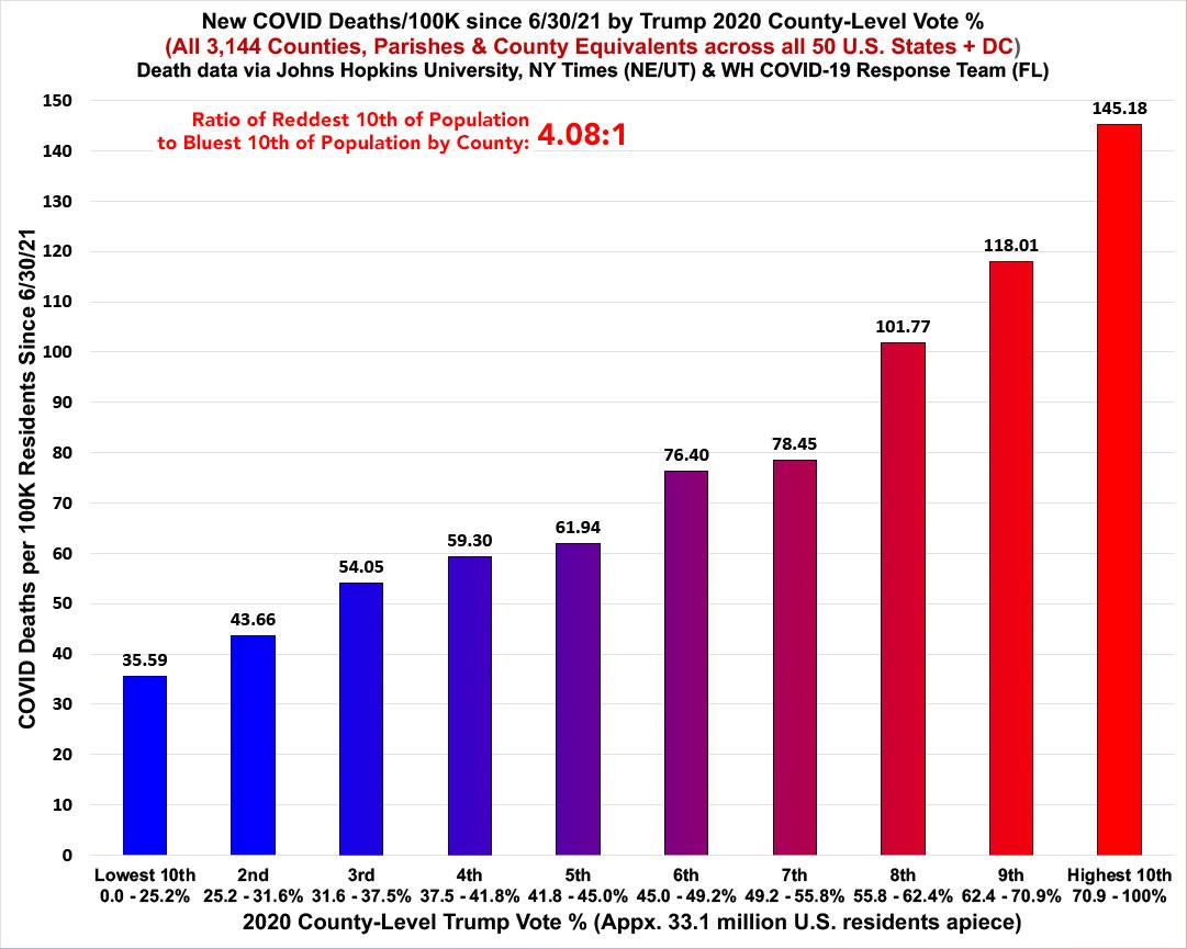
P.S. For the record, here's what the case & death rates since June 30th look like when broken out by 2020 partisan lean as of January 23rd. Both cases rate and death rate graphs are almost identical to their vaccination rate-based counterparts, except that case rates are still slightly higher in the reddest decile than the bluest, while death rates are still 4.1x higher in the reddest decile than the bluest.
Advertisement