The data below comes from the GitHub data repositories of Johns Hopkins University, execpt for Rhode Island, Utah and Wyoming, which come from the GitHub data of the New York Times due to the JHU data being incomplete for these three states. Some data comes directly from state health department websites.
A reminder that I made two important changes to the spreadsheet last week:
First, the Johns Hopkins Github archive has finally started breaking out New York City's data into the five separate boroughs/counties
Second, I've finally gone through and separated out swing districts. I'm defining these as any county which where the difference between Donald Trump and Hillary Clinton was less than 6 percentage points either way in 2016. There's a total of 198 Swing Counties using this criteria (out of over 3,200 total), containing around 38.5 million Americans out of over 330 million nationally, or roughly 11.6% of the U.S. population.
With these updates in mind, here's the top 100 counties ranked by per capita COVID-19 cases as of Saturday, September 19th (click image for high-res version). Blue = Hillary Clinton won by more than 6 points; Orange = Donald Trump won by more than 6 points; Yellow = Swing District
I'll have much more to say about this, of course, but tonight I'll keep it short.
The Texas Fold'em lawsuit to strike down the ACA (officially called "Texas vs. U.S.", "Texas vs. Azar" or, more recently, "CA vs. TX") is scheduled for oral arguments before the U.S. Supreme Court on November 10th, 2020...exactly one week after Election Day.
I'm assuming that the death of Supreme Court Justice Ruth Bader GInsburg doesn't change the date of the hearing; presumably it will be heard by the 8 other SCOTUS justices or (God help us) by all 9 if Mitch McConnell is able to ram through Trump's appointee in record time (November 10th is just 53 days away).
While Justice Ginsburg's passing under a Trump Presidency should strike terror into everyone's heart for 1,000 other reasons as well, the big fear about the Texas Fold'em case specifically is that it means either a) the ACA is dead if Trump manages to get a replacement on the bench, or b) even if he doesn't, a 4-4 split ruling would result in the case being kicked back down to the lower federal court...which would also mean the law is dead.
I'm not sure what's going on with Bright Health Care in Nebraska. They entered the state's ACA market in 2020, but for whatever reason they aren't showing up in the HealthCare.Gov Rate Review database. The only carrier listed for the state's individual market is Medica, and the SERFF database for Nebraska doesn't bring up either one.
Even more curious, when I ran a search to make sure that Bright hadn't simply jumped in and then out again the following year, I found this article:
Bright Health Plan announced today its 2021 expansion plan. It will expand access to its Medicare Advantage, individual and family-plan products in select areas, and to add fully-insured small business plans to its available products in certain markets.
Me, June 16th, after several months of various state-based ACA exchanges bumping out their COVID-19 Special Enrollment Period deadlines by a month, then another month, then another month:
At a certain point I'm guessing at least one of the state exchanges will just say "screw it" and open 2020 enrollment up for the full year.
The point of a deadline is a) to prevent people from trying to game the system by deliberately waiting until they're sick/injured before enrolling in coverage (thus driving up premiums for everyone else) and b) to goad people into actually taking action (deadlines do have a clear positive impact on enrollment). With the COVID-19 pandemic having thrown the entire healthcare system into disarray, neither of those seem to be much of a factor this year.
I've taken some amount of criticism from people who got the vapors and claimed that I was "politicizing" the pandemic, which is laughable in the Trump era, where everything has been politicized by the Trump Administration.
Six months into the pandemic, the United States continues to suffer the worst outbreak of COVID-19 in the developed world. Considerable blame belongs to a federal response that offloaded responsibility for the crucial task of testing to the states. The irony is that, after assembling the team that came up with an aggressive and ambitious national testing plan, Kushner then appears to have decided, for reasons that remain murky, to scrap its proposal.
HENDERSON: "One of the things which has been made really manifest during the COVID-19 pandemic is the weakness of our healthcare system. We're now coming up on about a decade of life under the Affordable Care Act, which of course expanded access to insurance and made some other changes, but there are still obviously a lot of inefficincies...there are a lot of insufficiencies.
Give us an idea of what you would support in terms of changes to the healthcare system, changes to the Affordable Care Act, to get more people covered at lower costs and make the system work better."
I don't know if this is an industry trend, a state regulator trend or new policies being implemented by CMS, but it seems that either more health insurance carriers have been redacting their Actuarial Memos and/or not uploading their URRT files to the publicly-accessible SERFF database or the state insurance departments, SERFF database and/or CMS's Rate Review database aren't posting as many of them publicly.
Case in point, Wisconsin: I have the average requested 2021 premium rate filings for every carrier on the individual and small group markets...but the actuarial memos are all redacted and none of the URRTs are available at all, making it impossible for me to run a weighted average since I don't know how many enrollees each carrier has. Also, for the second year running, Compcare Health Services doesn't appear in CMS's Rate Review database at all for reasons unknown.
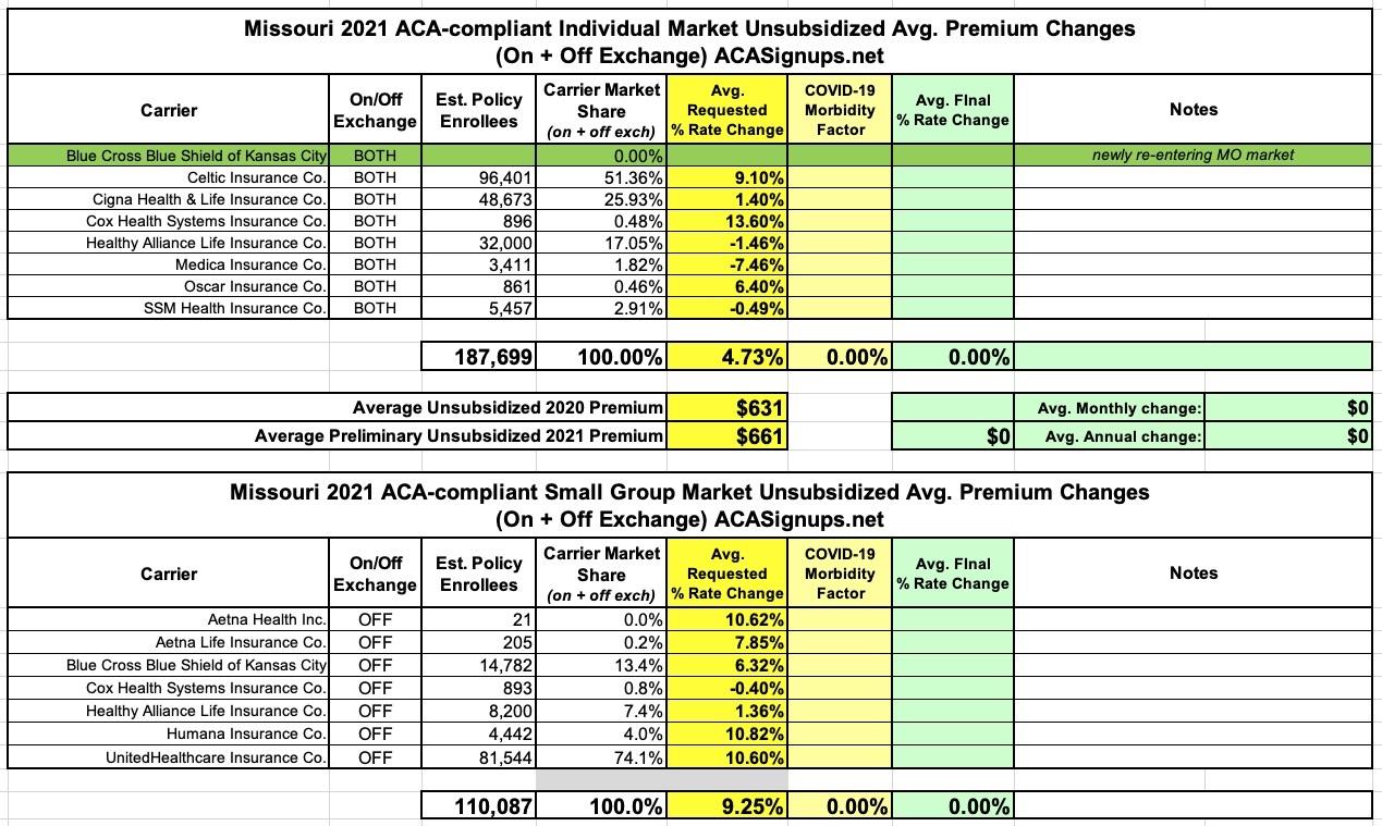
Missouri's preliminary avg. 2021 unsubsidized premium rate changes have been posted. There's one new entrant into the individual market this year (Blue Cross Blue Shield of Kansas City, which actually mostly pulled out of MO a couple of years back). Nothing too noteworthy--the average requested 2021 premium is going up 4.7% on the individual market and 9.3% on the small group market.
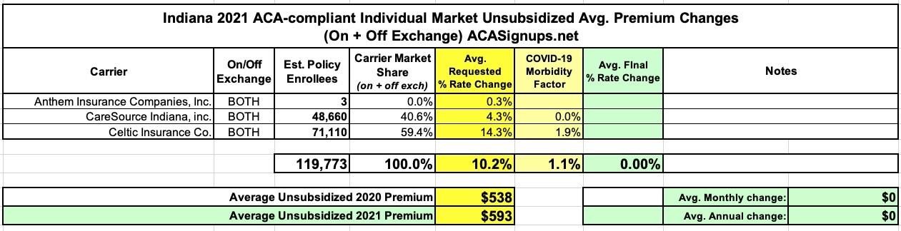
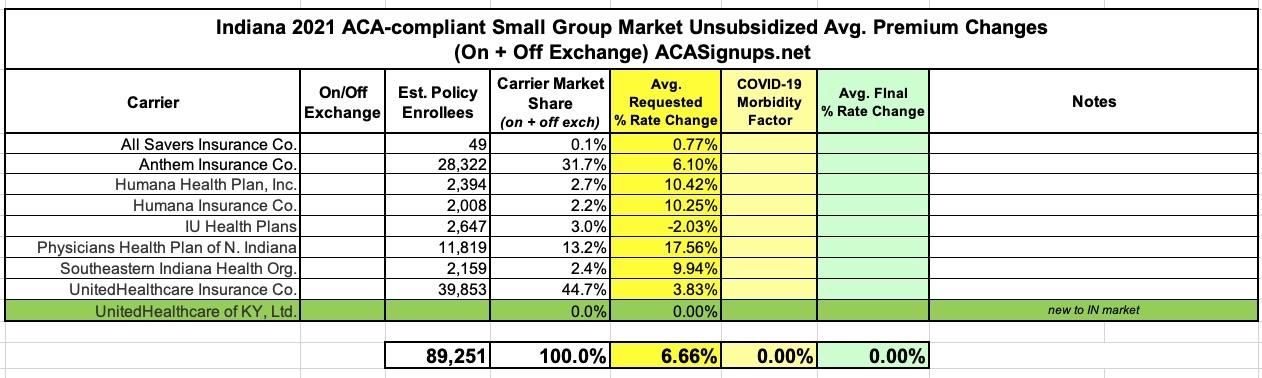
The Indiana Insurance Dept. has posted their 2021 individual & small group rate filings to the SERFF database. Nothing terribly noteworthy other than the average requested rate increase is unusually high for 2021 compared to most other states so far (10.2%, mainly via Celtic), and it looks like a second division of UnitedHealthcare is offering policies on the small group market next year:
The data below comes from the GitHub data repositories of Johns Hopkins University, execpt for Rhode Island, Utah and Wyoming, which come from the GitHub data of the New York Times due to the JHU data being incomplete for these three states. Some data comes directly from state health department websites.
A reminder that I made two important changes to the spreadsheet last week:
First, the Johns Hopkins Github archive has finally started breaking out New York City's data into the five separate boroughs/counties
Second, I've finally gone through and separated out swing districts. I'm defining these as any county which where the difference between Donald Trump and Hillary Clinton was less than 6 percentage points either way in 2016. There's a total of 198 Swing Counties using this criteria (out of over 3,200 total), containing around 38.5 million Americans out of over 330 million nationally, or roughly 11.6% of the U.S. population.
With these updates in mind, here's the top 100 counties ranked by per capita COVID-19 cases as of Saturday, September 12th (click image for high-res version). Blue = Hillary Clinton won by more than 6 points; Orange = Donald Trump won by more than 6 points; Yellow = Swing District