

UPDATED: Off-Topic: More Hillary Logo Obsession...er, Discussion
Tue, 04/14/2015 - 12:40pm
Yeah, I know, this is the 3rd off-topic post I've made in as many days, but it's kind of a slow week and I'm procrastinating on my day job at the moment. Besides, this is kind of nagging at me.
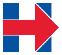
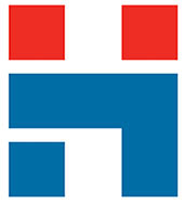
Hillary Clinton's new campaign logo (the "Arrow-H" or whatever) has been the subject of way too much discussion already, but I'm a website developer (if not really a graphic designer) so I can get away with it to a point.
The other day I noted that the only major issue I have with it is that mashing the primary red & blue colors up against each other is always problematic because those colors tend to bleed into each other (either literally on a print job or figuratively when you're looking at them). It's not Hillary's fault that the U.S. flag happens to include 2 colors that clash, but it is what it is.
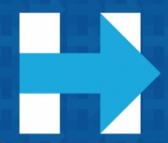
My suggestion was to simply add a thin white border around the arrow to add some space between the blue and red, but I didn't actually do so; here's how that looks, and I think that just this simple tweak improves it tremendously:
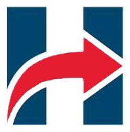
Alternately, simply changing the colors used can also help improve it...ironically, Clinton's campaign is using different color combinations on some of the marketing materials, and those versions actually work far better than the original:
Over at Vox.com, they've noted that DesignStudio.com held a contest to redesign the logo. While Vox only displays 6 of the entries, quite frankly I think most of them are actually far worse than the official one:
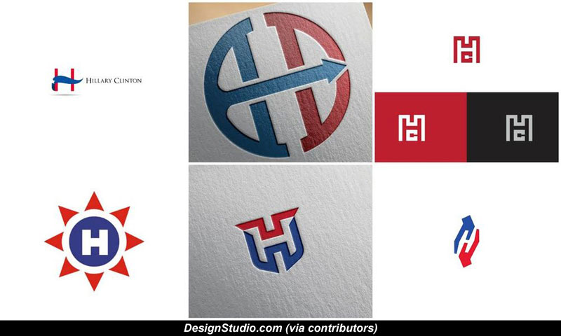
The first one looks like the printer ink leaked or something. As Mike Nellis noted via Twitter, the two in the center look like the logos/seals of Marvel/Bond villian armies. The one on the top right looks like it belongs to a luxury watch brand (which I'm guessing Ms. Clinton isn't going for), while the lower-right looks like a certain sexual position (although I'm guessing they were going for a "helping hand" theme). The one on the lower-left corner isn't too bad, actually.
They do also note a concept from another designer named Patrick Mauldin which works very well for me. It's not quite as close to the original as the one I did above, but does use the same white border edit that I used:

While his colors match better here, the baby blue might be too soft? Here's what the same version looks like with the original red:
Of course, if they were to go with either of these versions, they'd also be pushing very close to the Massachusetts Health Connector..although the current version is pretty close to Hadassah...

Anyway, that's my final post on the subject for the time being, I promise.
UPDATE: I finally realized what Clinton's logo reminds me of more than anything (I'm neither attacking nor defending her logo here, but this has been bugging me):
The system of international maritime signal flags is one system offlag signals representing individual letters of the alphabet in signals to or from ships. It is a component of the International Code of Signals(ICS).
Advertisement